
Studio monitor frequency response is one of the most-cited specifications you will see on speaker datasheets, sales pages, and reviews. It is also one of the most misunderstood. You will see numbers like “20 Hz–20 kHz ±3 dB” or a plotted graph labeled “Frequency Response,” but what do those numbers and graphs actually tell you about how the monitors will sound in your room, and how you should interpret them when choosing monitors for mixing?
This article breaks down frequency response specs, explains measurement methods and pitfalls, shows how to read response graphs, surveys some free and paid tools for measurement and calibration, explains why a perfectly “flat” monitor does not exist in practice, and outlines calibration strategies and why they matter for reliable mixing decisions.
1. What Is Studio Monitor Frequency Response?
Studio monitor frequency response is a measure of how a speaker’s output level (usually measured in decibels, dB SPL) varies across the audible frequency range (commonly 20 Hz–20 kHz). In simplest terms, it answers: if you feed the speaker a signal of equal amplitude at all frequencies, does the speaker output equal amplitude at all frequencies?
Key aspects to understand are:
Magnitude vs phase: Most consumer specs (and many graphs) show magnitude response only, that is how loud each frequency is relative to a flat reference. Phase response (timing/phase shift vs frequency) is rarely shown on marketing materials but affects transient coherence, perceived tonal balance and imaging.
Reference level: Response is plotted relative to a reference (often at 1 kHz or an averaged narrow bandwidth noise in the midrange). A ±3 dB spec means the response stays within 3 dB above or below that reference across the listed range.
Frequency range vs usable bandwidth: A spec like “20 Hz–40 kHz” may be meaningless if the low end is down -20 dB, technically present but useless. Usable bandwidth depends on the level at which deviations occur.
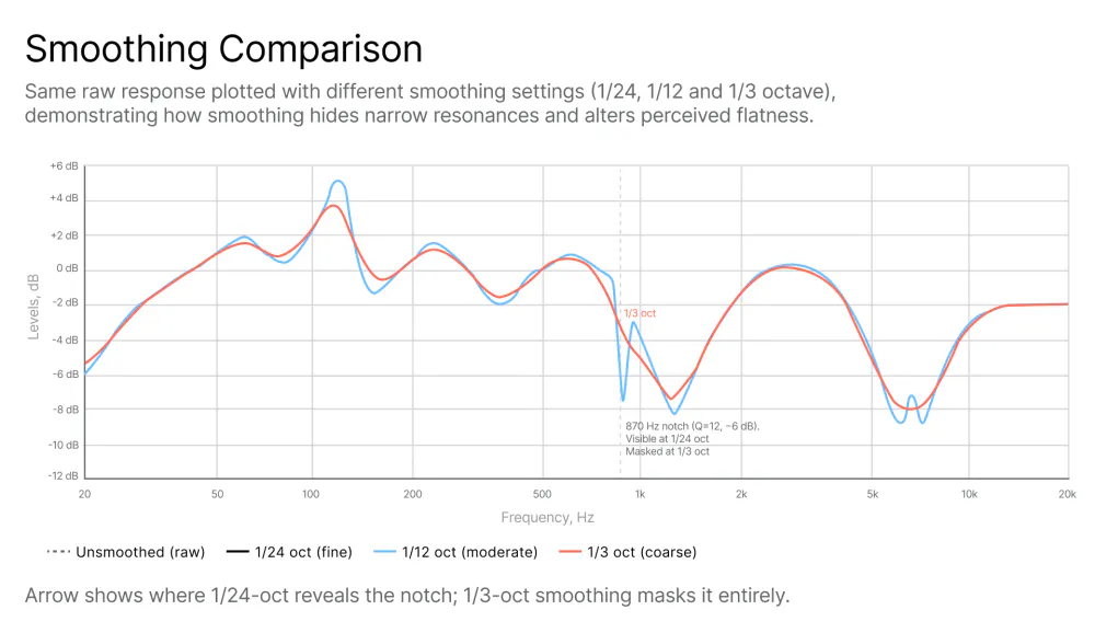
Smoothing and averaging: Response graphs may be smoothed (e.g., 1/3-octave smoothing) and may average multiple off-axis measurements. Smoothing hides details like resonances and ripples; unsmoothed data is more revealing although more difficult to interpret.
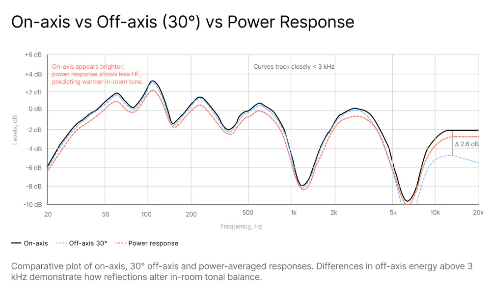
On-axis vs off-axis vs in-room: Most manufacturer graphs show on-axis (directly in front of the speaker) anechoic or quasi-anechoic measurements. Your room and listener position measure a combined response (speaker + room).
THD, distortion and power handling: Frequency response is often accompanied by THD (total harmonic distortion) vs frequency. A speaker may be “flat” at low SPLs but distort at higher levels, altering the effective response.
Impedance and sensitivity: These specs affect how the amplifier and crossover behave across frequency. Irregular impedance curves can cause frequency-dependent variations when paired with certain amplifiers or cables.
2. How Frequency Response Is Expressed
Frequency response may be expressed as a simple range with a given tolerance (e.g., 20 Hz–20 kHz ±3 dB).
What it means: between 20 Hz and 20 kHz, the amplitude remains within a 6 dB band (±3 dB). This is often a useful shorthand for how “flat” the speaker is across the band.
Caveats: tolerance width (±3 dB vs ±2 dB vs ±1 dB) changes interpretation considerably. ±3 dB is considered reasonably flat for affordable monitors; professional nearfields often claim ±2 dB or tighter.
Frequency response is most commonly expressed by curves (graphs) that plot dB vs frequency. Look for the reference point and axis scaling. Useful graphs show both on-axis and averaged off-axis or power response.
Caveats: smooth curves hide anomalies; extended low-end may be shown at very low relative levels.
3. Measuring Studio Monitor Frequency Response
Understanding how measurements are taken and how that affects the specs helps you interpret the data. There are several ways to perform measurements; among them, the most important are:

A) Anechoic measurement A speaker placed in an anechoic chamber with a measurement mic at a fixed distance on-axis, removing any room reflections. Pros: shows the speaker’s intrinsic acoustic behavior. Cons: real rooms are not anechoic; on-axis only tells part of the story.
B) Quasi-anechoic (MLS or gated impulse) Uses time-windowing of impulse response to exclude reflections in non-anechoic rooms. Pros: useful for lab scenarios without full anechoic chambers. Cons: time-windowing sacrifices low-frequency resolution (you may lose precise sub-100 Hz info).
C) In-room (nearfield or listening position) Measurement mic placed at the listening position; includes room modes and reflections. Pros: having the speaker and room response combined, it provides a realistic indication of what you hear. Cons: mixes speaker and room response, which is good for calibration but not for judging speaker intrinsic accuracy.
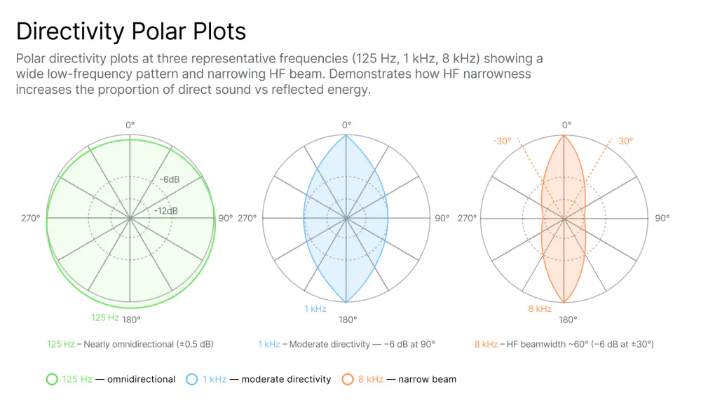
D) Off-axis and polar plots. Measurements taken at different angles to show dispersion and directivity. Pros: important for predicting room interaction, size of the sweet spot and imaging. Cons: rarely shown in marketing materials.
4. How to Read Frequency Response Graphs
For a deeper practical walkthrough, see: How to Use Frequency Response Graphs to Improve Your Room Acoustics
The steps to read the graphs involve, among all other things, checking the axis scaling and the smoothing of the data.
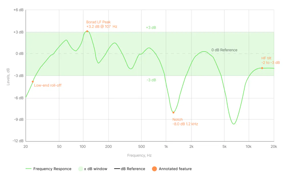
Regarding the axis scaling: vertical range matters most. ±3 dB over a 6 dB range looks flat; if the axis shows ±15 dB, the same variation looks small.
A 1/3-octave or 1/6-octave smoothing looks really nice and is much easier to read but hides narrow peaks. Unsmoothed or lightly smoothed curves (1/24–1/12 octave) show real resonances.
General guidelines to the interpretation of frequency response graphs include:
Identifying the reference level and on-axis vs average: is the curve on-axis (0°) or averaged across angles (±15°/30°)? Averaged curves are more representative of perceived tonal balance in-room.
Looking at low-frequency extension vs level: if the low end rolls off gradually, note the dB at 20–40 Hz. A “20 Hz” spec is only meaningful if the level there is within a usable dB range.
Observing peaks and dips and their widths: narrow peaks or dips can be resonances or measurement artifacts. Wide dips (e.g., a 3–6 dB dip spanning decades) affect perceived tonality and are harder to fix with EQ.
Considering directivity and off-axis behavior: a speaker that is flat on-axis but becomes bright off-axis will interact with room reflections and sound brighter in-room than the on-axis plot suggests.
Minding phase and group delay info (if provided): large phase shifts or group delays in the lower octave can smear transients, making bass sound loose. Phase graphs are uncommon but useful for diagnosing time-alignment or driver integration issues.
5. Does “Flat” Really Exist?
When it comes to studio monitor frequency response, “flat” is an engineering ideal, not a guarantee. “Flat” means equal amplitude at all frequencies.
In the real world, there are no ideal components. Manufacturing tolerances mean drivers and crossovers are not perfectly consistent; two units of the same model may differ slightly. On top of that, as stated in section 3, the measurement method impacts the data. Anechoic vs in-room produce different curves; on-axis flatness can still yield uneven perceived in-room balance.
There are also tradeoffs between directivity and on-axis flatness. Designing a speaker that is flat on-axis and still preserves tonal balance off-axis is much more difficult. Narrow directivity can reduce room interaction but makes the sweet spot very restrictive and impractical for most studio setups.
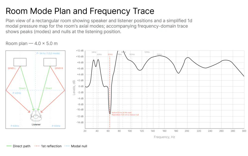
The speaker inevitably interacts with the room. Room modes (also known as eigentones) produce large frequency-dependent peaks and nulls below approximately 300 Hz. No speaker alone can be flat in-room in a practical control room without acoustic treatment and/or Digital Room Correction (DRC).
Human hearing adds another layer. Fletcher-Munson research shows that our ear’s sensitivity varies with level; “flat” measured SPL will not correspond to perceived neutrality at various listening levels. While some engineers prefer a slight “air” boost or controlled low-end roll-off for translation across systems, some prefer the contrary. There is a substantial body of objective, scientifically rigorous research on this subject, most notably the work of Toole and Olive published in the Journal of the Audio Engineering Society, with data-backed findings on what measurement characteristics actually correlate with listener preference.
For a detailed breakdown of how target curves work in practice, see: Target Curve Options in SoundID Reference Explained
So “flat” is just an engineering target, not a guarantee of success. The meaningful objective is not flat but a known, consistent, predictable behavior across listening situations and the ability to translate mixes to other playback systems.
6. Calibration
The practical solution for calibration (also called digital room correction or reference-level tuning) is the way to turn imperfect speakers and an imperfect room into a usable monitoring system for mixing.
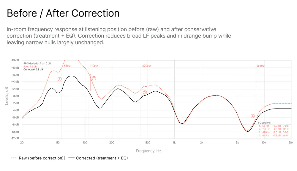
Calibration corrects broad tonal imbalance caused by room modes and speaker-room interaction, smooths out dips and peaks that are correctable (broad anomalies), and improves translation and judgement of tonal balance. On top of that it can align left/right or multichannel balance and set reference SPLs for metering and loudness consistency.
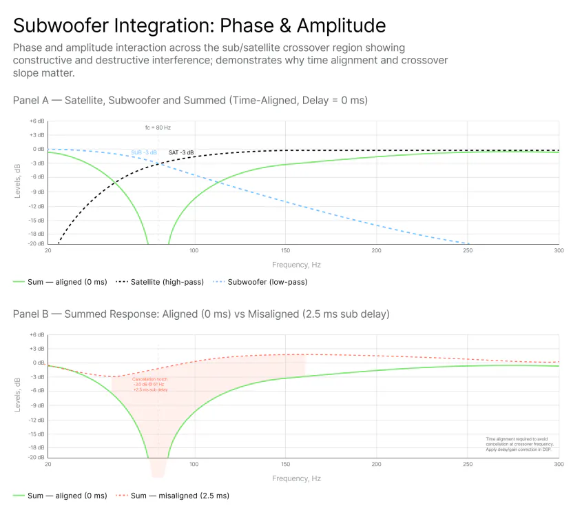
Calibration will not be able to fix narrow, sharp nulls caused by destructive interference at a single listening position (e.g., a 10–20 dB notch at 80 Hz). These are time-related problems that usually require position changes, subwoofer placement adjustment, or acoustic treatment.
Calibration is not magic. It cannot make a poor speaker into a great one and it will not fix driver distortion or chaotic directivity. Also, there is no free lunch: calibration implies that to make it sound better at a given listening position it will make other positions sound worse. Above all it will require DSP resources and implies latency, but given today’s CPU speeds and processing power standards, this is rarely an issue.
7. Calibration Approaches
Acoustic treatment: bass traps, absorption, diffusion. Treat early reflection points and bass build-up before heavy EQ. There is no perfect design for acoustic control of spaces and the help of a professional acoustician is highly recommended. A good design may involve judicious combinations of absorption, reflection and diffusion based on models, measurements and calculations.
Level matching and time alignment: ensure speakers and subwoofer are well-positioned, time-aligned and level-calibrated to a reference SPL (e.g., 83 dB or 85 dB SPL for room calibrations). Choose a level consistent with your metering and loudness workflow.
Manual EQ: measure the room and apply corrective EQ cuts to tame broad peaks.
Automatic or semiautomatic DSP-based correction: software measures multiple positions and generates filters (FIR or IIR) to flatten response or calibrate to a given target at the listening position(s).
8. Tools for Measurement and Calibration
Free tools:
REW (Room EQ Wizard) for Windows, Mac, and Linux provides a very powerful measurement suite: frequency response, waterfall, RT60, room mode identification, and EQ filters (IIR). In spite of being the industry standard for DIY measurements, this powerful tool is often misunderstood and can mislead the user; the learning curve can be steep.
Other free tools include Equalizer APO + Peace GUI (Windows), ARTA (in free demo mode), and Audacity with plugins like Aurora from Angelo Farina. All these tools provide a viable solution but require thorough understanding of the subject for consistent and reliable results.
Paid tools:
Hardware devices like the Trinnov Optimizer offer high-end room correction that is extremely capable but very expensive. Professional audio measurement and analysis suites such as Smaart (SIA) or RITA (Global Audio Solutions) are widely used in live and installed sound for system optimization, a different approach but conceptually close to calibration.
There are also more user-friendly solutions like Sonarworks SoundID Reference, which provides automatic correction for both headphones and speakers. The main advantage of the SoundID solution is the automation of the process: it integrates the measurement, the creation and implementation of correction curves, and real-time correction via DAW plugins, system-wide virtual drivers, and direct hardware interface support, offering a complete solution deployable not only by engineers but also by producers and creative individuals without specific technical knowledge. See: How SoundID Reference Measures Frequency Response Accuracy
For users working across both speakers and headphones, the process and approach differs meaningfully. See: Headphone Calibration: How It Works and Why You Need It
Note: all of the tools cited above require calibrated measurement microphones to perform accurate captures.
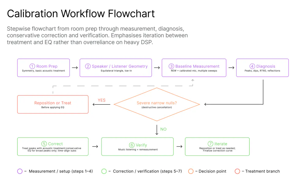
9. Basic Practical Calibration Workflow
Room preparation Place speakers symmetrically if possible and create an equilateral triangle between speakers and listener. Avoid extreme proximity to side walls. Place acoustic treatment at first reflection points (absorption) and bass traps in corners for low-frequency control. There is not a perfect design for acoustic control of spaces and the help of a professional acoustician is highly recommended. A good design may involve judicious solutions including absorption, reflection and diffusion based on models, measurements and calculations.
Level and time alignment Match speaker levels using an SPL meter or software (set to pink noise or M-noise and average SPL). Align subwoofer delay and crossover.
Measure Take measurements at the listening position and a few nearby positions to gauge variance. If using a manual solution, use sweep or MLS depending on the tool.
Interpret and diagnose Look for narrow dips (nulls) vs broad peaks (modes). Nulls often require repositioning; peaks can be EQ’d. Identify RT60 and early reflections.
Apply correction conservatively Use EQ to tame peaks, not to boost nulls. Apply gentle broad filters and avoid large boosts, which increase distortion or excite resonances. For sub/sat integration, use crossover slopes that minimize phase and alignment problems, such as the 24 dB/octave Linkwitz-Riley filter topology.
Verify with music and flat sweeps Play reference tracks you know well, then re-measure to confirm improvements. Ensure the system sounds natural and that transient response is retained.
Iterate Reposition speakers or listener slightly if severe nulls persist. Add treatment if needed. Aim for translation of mixes to other systems rather than absolute textbook flatness.
10. Why Calibrating Frequency Response Matters for Mixing and Production
Uncorrected peaks or dips bias mixing choices by affecting tonal balance. For example, a 3–5 dB bass boost in-room will cause you to reduce bass in your mix, which will sound thin on other systems. An uncalibrated mixing environment may induce frequency masking and loss of mix clarity: a bump around 2–4 kHz can make vocals or guitars seem harsh; a dip can lead you to overcompensate and muddy mixes.
The goal is that the mixes you finish in your room will translate, meaning they sound similar on cars, earbuds, and mastering rooms. Calibration definitely helps achieve that.
Having a calibrated monitor system also improves confidence and speed: knowing your environment is under control reduces second-guessing and speeds decision-making.
Conclusion
Studio monitor frequency response specs are a starting point, not a final answer. They are useful only when you understand what they represent and how measurements are taken. A “flat” speaker on paper does not guarantee a flat listening experience in real rooms, nor may be desirable for all situations. Marketing graphs can be smoothed or selective.
The right approach is a combination: pick monitors from a respected manufacturer that provide good, trustworthy measured behavior (tight tolerance, controlled directivity), then measure, diagnose and calibrate your room with the appropriate tools for you, those you can afford and understand. Use acoustic treatment to address problems that EQ cannot fix.
Calibration is the practical way to achieve predictable, translatable mixes, because in the end, what matters is not perfect flatness in isolation, but consistent, reliable monitoring behavior in your environment.
When you combine good monitors, careful measurement, conservative correction, and sensible treatment, you will make better mixing decisions that translate beyond your studio.
Continue reading on the subject:
Why Studio Monitor Calibration Is Essential for Accurate Mixing in 2026


